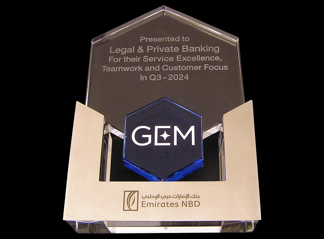
Building a clear award hierarchy
Corporate awards often need to carry more than a recipient name. Organisation branding, programme identity, award title and presentation details may all need space. The artwork is arranged so the most important information is seen first, with supporting wording sized and spaced to remain legible.
Preparing logos and lettering
Supplied logos are checked for line weight, small detail and suitability for the available engraving area. Vector artwork is preferable because it can be resized cleanly, although other high-quality files can be assessed. Lettering is proofed carefully, especially where names, titles or event information will be permanently engraved.
Selecting the engraving method
The appropriate process depends on the glass composition, award shape, artwork and finish required. Flat areas are measured and the design is positioned clear of bevels, edges and the base. Where contrasting colour is appropriate, it can help distinguish separate identities and strengthen important elements of the presentation.
Consistency for corporate awards
For several awards, a master layout can retain the same organisation branding while allowing recipient names, categories or dates to change. Alignment, scale and spacing are kept consistent across the set, with every variable detail checked against the supplied list before production.
Final quality checks
The completed award is inspected for clean engraved detail, accurate positioning, correct wording and an even overall finish. This methodical preparation is important for one-off executive presentations as well as repeat recognition programmes and event quantities.